Monday, 29 January 2018

Exam Question about The Observer home page

PREP Answer the exam question. You will find page 9 of News (print and online): industry and audience helpful.


The Observer home page uses a array of techniques to captivate and entertain its audience. The Observer audience generally think of themselves as open-minded and accepting and so the observer tend to allow both sides to have an argument in articles. 

The layout of the observer front page helps to create meaning.The titles use the Serif and Sans Serif fonts because they are easy to read and look very professional and formal. It has been shown that with these fonts the human eye finds it easy to read from one word to another. The Blue, white and Maroon colour scheme used on the front page imply: Formality,  seriousness, fairness, royalty and professionalism. The different news articles are laid out into different sections (e.g. feature, sport, interviews, etc.), this layout makes the paper look professional and also makes it easier for the reader to find articles they will want to read.  All of this gives the reader a sense of professionalism themselves because they are reading a professional looking newspaper. 

The Observer display the "top" news stories on its home page and these tend to be stories that the audience are most likely to be interested in. The title of these stories often display their titles in a certain way to interest the reader and make them want to learn more. The titles give the reader a small hint of the topic of the article, whilst still leaving an air of mystery. For example the title "Can i forgive the man who raped me?", instantly draws the reader's attention. It makes them ask questions such as: "Who is it that was raped?", "Who raped that person?" and "Can they forgive him?". The reader is curious to find out more and reads the article to answer their questions. Another example of this the title "Stranded refugees denied UK asylum face "life in limbo"", immigration and refugees are still topics that will grab a readers attention and make them want to find out more. 

Another way the Observer home page grasps its audience is by providing surveillance of world events. It tells readers what is going on in the world, both in terms of gossip about celebrities, sports news, news about the latest politics and any social problems going on (e.g. disaster, criminals, refugees etc.). The "sports" section on the observer home page provides readers with information on the latest; Football, Tennis, Rugby, Boxing, Cycling and many other forms of sporting news. Readers who are interested in sport are sure to read this section. In the "interviews" section, the Observer can provide readers with news on the secret lives of famous people and what they think about certain topics. People interested in political and social issues will be interested in the large majority of the paper because they want to read news about recent events. The Observer presents readers with the opportunity to find out whats happening in the world and form an opinion on it.  

By having an online newspaper, the Observer allow for a response from their audience. If readers have a strong opinion about a topic that has been covered in the newspaper they can write to the paper or go to social media and discuss the topic with other readers of the same newspaper. The Observer allows for social discussion and debate between readers, strengthening  peoples opinions and allowing them to seek reassurance from people who hold a similar opinion to them. 


Wednesday, 24 January 2018

Creating Media in class

In class we created our own Media in groups, around the concept of enigma. The basic plot my group came up with was that a strange package is delivered to some people (Tom and Charlie), and they are wondering what the package might be. They then open the package to find a head inside (me (Ben)) and are even more curious about where it came from. We then see the delivery person (Callum) outside waving and smiling creepily.

We used a range of dynamic shots from several different angles. For the bit with the head in the box, we cut a hole in the bottom and i stuck my head in whilst lying under the tables. We then put bubble wrap around my head to cover up the hole. After Tom asks the question "Who would send us this?" the camera then turns to see Callum standing outside the door, suggesting that it was him who sent the package.

At times we had some trouble with getting the camera to focus but apart from that it was relativley successful.

Sunday, 7 January 2018

Lego Movie poster campaign

Exam question: Analyse how genre codes have been used in The Lego Movie poster campaign to appeal to a family audience. (10 marks) Write the equivalent of a page and a half A4 in the exam. This is a major question.

The Lego Movie posters appeal to a mass, mainstream and family audience. They entice the target audience to see the film by appealing to the different groups.


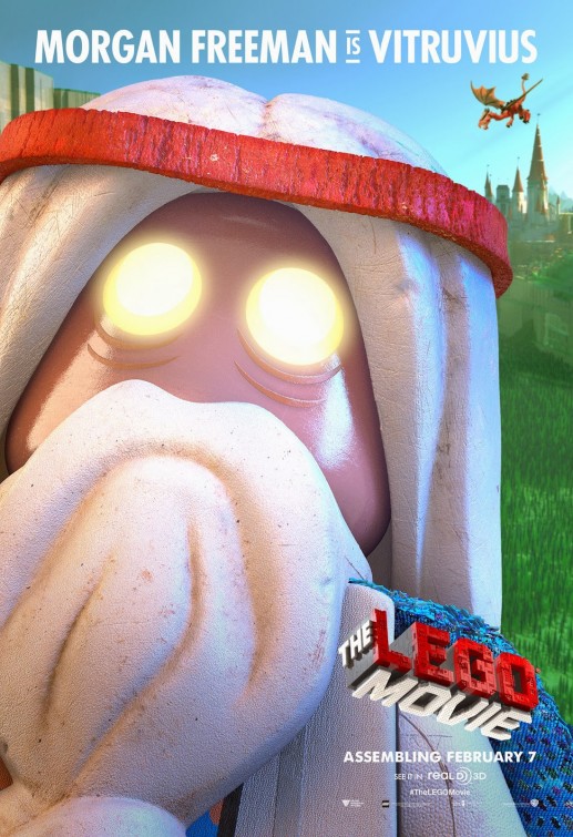
The Lego Movie Movie PosterThis poster presents one of the film characters, Vitruvius. The poster advertises that Virtruvius is voiced my Morgan Freeman. This might entice a large verity of people to see the film as Morgan Freeman is a famous household name. Some of the other posters show other actors in the film, such as: Will Ferrell, Liam Neeson, Elizabeth Banks and Chris Pratt also star in the film and if people know and like certain actors that they know are in the film they will be more likely to see the film. 


The Lego Movie Movie Poster
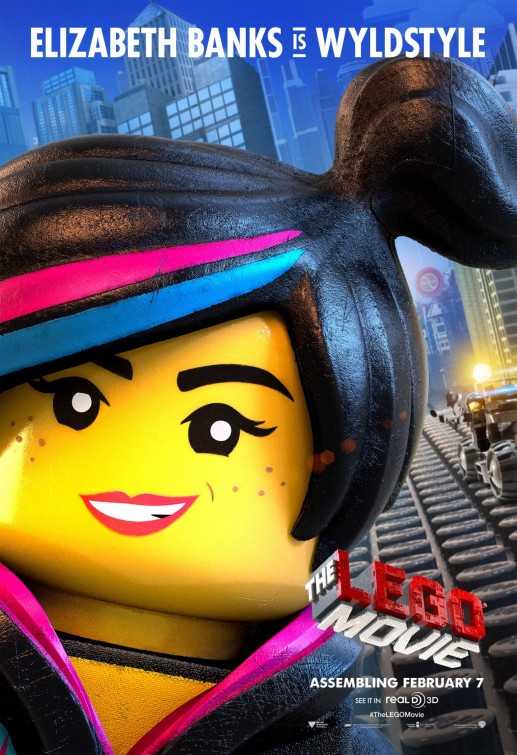
This poster would help the film appeal to the audience of girls as it shows a strong, independent female character. If people have heard of Elizabeth Banks then it might make them want to see the film more as it has an actor who they recognise. 


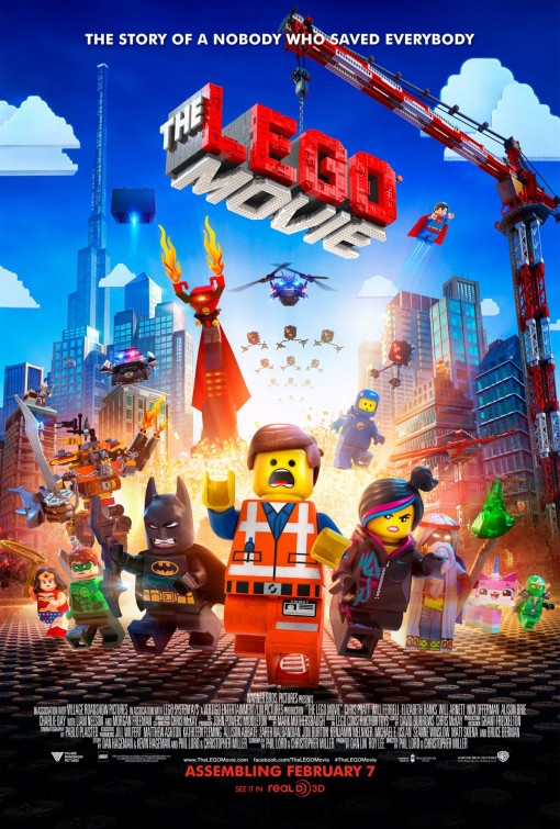
The Lego Movie Movie PosterThis is the main Movie poster and can appeal to the audience in a lot of ways. The explosion in the background suggests there will be a lot of intense action and danger in the film which might appeal towards a teenage audience. 
A lot of people will be able to recognise some of the superheros such as: Batman,Wonder Woman and Superman. 

Lord Business can be seen in the background and is very obviously the villain. He is chasing the the heroes and so are his "Micro-managers" which gives a sense of danger. But there is still hope as he hasn't actually caught the heroes and so the have a chance of escape.  

The Slogan at the top "The story of a nobody who saved everybody" can appeal to pretty much everyone. Emmet who is right at the front of the poster is the hero of the film even though he looks very ordinary. Most people think of themselves as ordinary as well and so when they see that an ordinary person saved the whole world in this film, it will not only intrigue them to watch the film and find out how he did it, but it will give them a feeling that they too can accomplish anything. 
Emmet looks even more ordinary because he looks absolutely terrified whilst he is running away, whilst everyone else looks serious and concentrated. This further shows that he is not a stereotypical hero and also adds an aspect of comedy due to Emmett's expression. 


Thursday, 7 December 2017

Q8 Uses and Gratifications of video games


Blumler and Katz's theory is that of uses and gratifications. The theory states that audiences seek out media to meet their specific wants and needs. They believe audiences seek out specific media for four main reasons: surveillance, relationships, values and relaxation. Surveillance is when they see what other people are doing in the world and how they deal with it. They watch certain films or TV shows to build relationships with the characters and other people who watch the same things. The audience mainly view media that reflect their own personal values and they view media to relax after a long day. Audiences will play different video games for the same reasons. 


The Lego Movie Video Game will generally appeal more to younger audiences, even though the film upon which it is based can appeal to a wide age range. An example of gratifications children may get out of the game is the sense of good and evil. They will be rooting for the "good guy", such as Emmet and Wyldstyle, to win instead of the "bad guys", such as Lord Business,; this is an example of values, which the children believe in, being reflected by the game.

An example of both, values being reflected and relationships, is the fact that Emmet is presented as an ordinary guy. A lot of kids can relate with Emmet because they feel that they are also very average and ordinary people just like Emmet is. To see an ordinary person become a hero, who "saves the day" gives them a sense of determination and hope that they too can accomplish their goals and dreams.


Although mainly set for a younger audience a younger audience may enjoy the game and film for some of the jokes and references in it. For instance the frequently referenced "Piece of resistance", although it might go over the heads of most  children, is a clear play on words of the French saying pièce de résistance. This is just one example of jokes and references which can satisfy the gratifications of the older audiences. 

Another example of relationships is that of the recognition of the characters. People will recognise the characters from the Lego Movie game, from the film and/or the actors which voice the charterers. For example if someone's favourite actor is Chris Pratt, they will have their gratifications met because Chris Pratt voices the character Emmet. 

In conclusion, people will play specific video games for the same reasons they might watch specific films; they recognise and relate with the characters in it, they find out how the characters deal with certain situations, they see their personal values reflected by the narrative and they enjoy it and like the game-play. 


Wednesday, 29 November 2017

Contrast between music magazine covers

PREP: Analyse the media language of the MOJO cover below. Use the terms that you have learned.
Compare and contrast the cover with another magazine cover, drawing attention to the similarities and differences, and saying what the genre codes and conventions are.

The contrast cover can either be your own cover or another professional cover.


Image result for music magazine covers


Above are two different music magazine covers. One is a "MOJO" magazine featuring David Bowie, the other is a "Q" magazine featuring Ed Sheeran. Their layout, colours, imagery and general design all have differences and Similarities to each other.  


A similarity they share is the layout of their cover lines. They both have cover lines, about other stories in the magazine, running down the sides with the name of the band, person or place in large letters, then a little sub-heading beneath it briefly describing the story. Another similarity they have with each other is the fact that they have the name of the artist (singer) featured in the main splash, in large letters, in front of that artist. This is to help emphasise that the main story will be about that artist and possibly about an interview they gave. They also both have puffs and pugs, trying to entice readers by telling them what special things are inside. The way they phrase their puffs, e.g. "Essential 50 albums of 2014", makes the reader feel they not only want, but need what the puff is promising.  

A difference the have is the position of the masthead. The MOJO magazine follows the usual convention and has it in the middle-top of the page, slightly covered by the artist featured in the main splash. However, the Q magazine has it in the top-left corner, not really covered up at all; but it does have a strapline that is slightly covered by the head of ED Sheeran. A large difference between the magazine is the eye contact, wile David Bowie is staring right at the camera slightly menacingly, Ed Sheeran is looking of into the distance as if he is day-dreaming. This could suggest a number of things; maybe that David Bowie feels his fans want to feel more relateable to him and Ed Sheeran thinks that his fans don't feel they need that kind of recognition. Also in the MOJO magazine the picture is taken from a low camera angle whilst Bowie is standing up, but the Q magazine has a mid-shot and close-up of Ed-Sheeran whilst he is sitting down. The Q magazine has Ed Sheeran being lit from straight on, but the MOJO one has Bowie lit from the side. 


Friday, 17 November 2017

02 Music MOJO magazine 2017


Question: 'How representations on magazine covers reflect the social and cultural contexts in which they were produced'.

MOJO is a magazine which gives an incite into the most recent developments in the music world. They mainly focus on rock musicians but they sometimes feature other genres. They have a main band featuring in each monthly magazine. There was a recent one on the Sex Pistols.

MOJO clearly think very highly of their own brand. Some quotes of them describing their magazine are:
"Every month MOJO brings you a definitive cover feature on an iconic act; a bespoke CD (especially compiled by the editorial team or a major musician in MOJO’s world)"

"MOJO is the WORLD’S LARGEST UK MUSIC MAGAZINE, delivering a monthly dose of world class journalism and iconic photography to an audience of extremely passionate music consumers."
"MOJO is THE MUSIC EXPERT – a magazine of high brand values and integrity. A carefully crafted musical archive covering the very best of music across genres. From classic and modern rock, folk, soul, country to reggae, electronic and experimental. It prefers to celebrate quality over popularity – music that will stand the test of time."

The Sex Pistols were a punk rock band, that were active from 1975 to 2008. They were a very aggressive, controversial, in-your-face, down-with-the-establishment type band that had a large following and a large amount of people who hated them. They constantly showed defiance to the establishment.

They were a huge shock to the establishment as nothing like that had been seen before. When they went on a talk show they kept swearing over and over. As swearing was not at all socially acceptable people were shocked at the Sex Pistols' outrageous behaviour.

The MOJO magazine that recently featured the Sex Pistols used the colours pink and yellow on their cover. This was because the Sex Pistols themselves used these as their main colours.